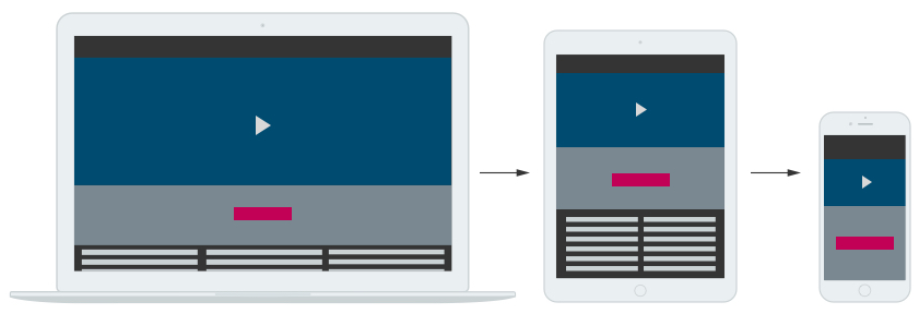
What is Responsive Web Design?
A responsive Web design (RWD) allows a website to resize and reformat automatically, depending on the device being used to view it. It makes the most of any screen layout and size through the use of Media Queries and CSS. This leads to optimum viewing and best user experience.
To view the effect of a responsive website, simply access it via different devices such as your desktop computer and your mobile phone. You can also adjust your browser window, and you will notice how the website adapts itself.
The Challenge
The website in this project consists of a basic layout with a non-responsive design. The challenge is to convert the layout to a responsive design adaptable to all types of browsers, screen formats and devices, whether computers, tablets or smartphones.
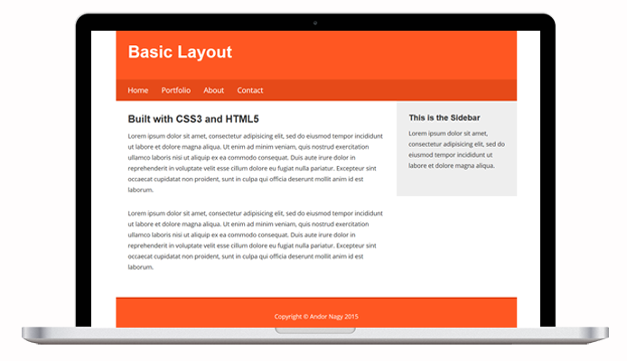
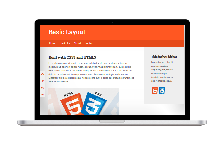
The Original Website
The layout of the original website has a fixed width which doesn't fill the laptop screen. This results in white space at the left and right edges of the layout.
We also see problems while viewing the original website on a mobile device. The phone layout is especially problematic as it is condensed to the point of not being able to read the screen. This is partially due to the lack of an HTML Meta Viewport element. Without this element, mobile devices render pages at typical desktop screen widths, and then scale the pages to fit the mobile screens.
With the help of HTML, CSS and Media Queries, we'll make adjustments to elements in the layout that will fix this. Read on!
The Conversion
The first step in converting this website to responsive design is to add an HTML Meta Viewport element with content of width=device-width, initial-scale=1. A Meta Viewport element gives the browser instructions on how to control the page's dimensions and scaling. This sets the width of the page to follow the screen-width of the device being used.
Container & Element Widths
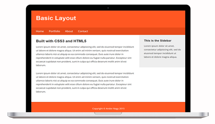
Next, the container width is set to 100%. This is done so page elements such as the header, navigation bar and footer fill the entire width of the screen. This eliminates the awkward white margins on the left and right sides.
We then follow with setting individual page elements (header, navigation, main, aside, footer) to width: 100% in CSS. This allows for stacking of elements on mobile screens. You will see the effects of this later in this tutorial.
Fonts
The Google Font link was fixed to accurately display Roboto Slab as the headings font. The font @import was removed from CSS and replaced with the Google Fonts API via HTML link tag. As a rule of thumb, you may want to avoid @import rules because they defer the loading of the included resource until the file is fetched.
Images
Images were added to enhance the layout. The images are aligned left and set to max-width: 100%, height: auto so they do not expand beyond their containers. The footer was changed to align left to coincide with the left-aligned page layout.
Navigation
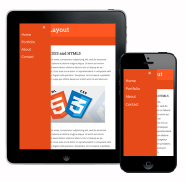
Screen space is a precious commodity on mobile, and out next step is to implement a separate navigation for mobile devices. A media query breakpoint of 991 px was created. At this breakpoint, the main navigation is hidden and the mobile navigation is displayed. A hamburger button icon is used to activate the mobile menu.
Media Queries
Several media query breakpoints were created based on content display. Padding, margins, and font sizes were adjusted for optimum viewing. (Google recommends this be done based on content vs. individual devices.)
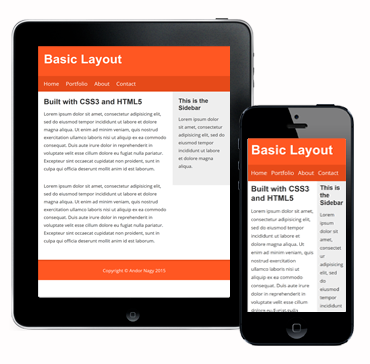
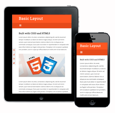
Stacked Content
Due to each element being set to 100% width, you can now witness how the elements stack, one above the other, on mobile devices. When you scroll the page, you'll find the gray sidebar stacked neatly underneath the main content, followed by the footer at the bottom.
Enhancments
Although this is a short page, a few enhancements were added, including a scroll-to-top button and a fixed social navigation bar. The social navigation is hidden on smaller phones.
Here is a view of the mobile menu after activation. The drawer panel is hidden beyond the left edge of the screen and revealed only upon the user’s action. Note the panel covers the viewport height of any device.
The Final Result
After converting the website to a responsive design, you can see it now looks great across devices — desktop, laptop, tablet and phone!

You can go to the project website to view the full code.
Keep On Coding!
We hope you have found this tutorial helpful in your quest to learn responsive design! Until next time, happy coding!

Projects
