Users expect to be able to interact with everything from mobile devices to their automobiles with the touch of a finger. However, there are many considerations to weigh when it comes to designing the most effective touch-screen interface for a device.
Let's take a look at some best practices to integrate into the design and development process for an effective touchscreen UI.
To deliver a positive user experience, it is essential to keep the user's needs and preferences in mind. The goal is to create a streamlined touchscreen interface that welcomes users and permits them to complete a task as quickly and easily as possible.

Start your website design with a mobile-first approach. Carefully account for all elements within the Web design and consider how these pieces will scale up and down responsively.
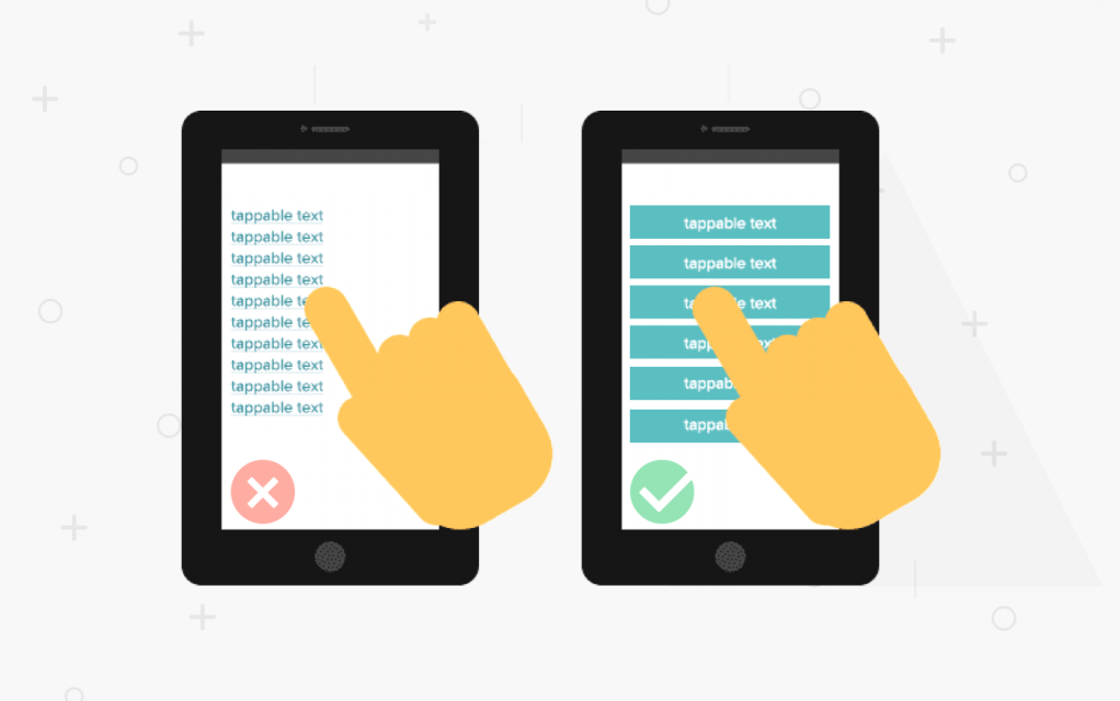
On smaller touch screen mobile devices, it is imperative that Web page elements, especially navigational elements, are large enough for the user to press without the risk of touching other nearby links.
Include proportionately-sized graphics and page elements that help create a more fluid and consistent browsing experience for users.

Swipe space is often an overlooked component of a great touchscreen user experience. It is the area within the UI design that is free of navigational or interactive elements. It allows a user to touch the screen and swipe up, down, left or right, and navigate without accidentally engaging another link.
Also consider spacing between targets. If action buttons are too close to each other, you risk the user making undesired actions, leading to frustration. It is especially important to space out contradicting action buttons, such as the save and delete buttons, to avoid errors.

Provide a navigation system that is largely familiar and expected.
Users should intuitively be able to navigate through your site via clear pathways and be able to complete all primary tasks easily and effortlessly. They should always know where they are without wondering how they got there, or what they need to do next.

Less is more. Keep interface elements to a minimum. Simple designs are what keeps the user engaged. A responsive design is essential.
Display only content and functionalities that the user needs. The limited space available on a small screen makes every additional element you add overwhelming to your users. Secondary content should be available through a menu. Use icons instead of text, wherever possible.
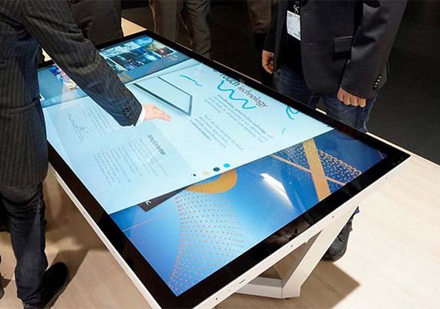
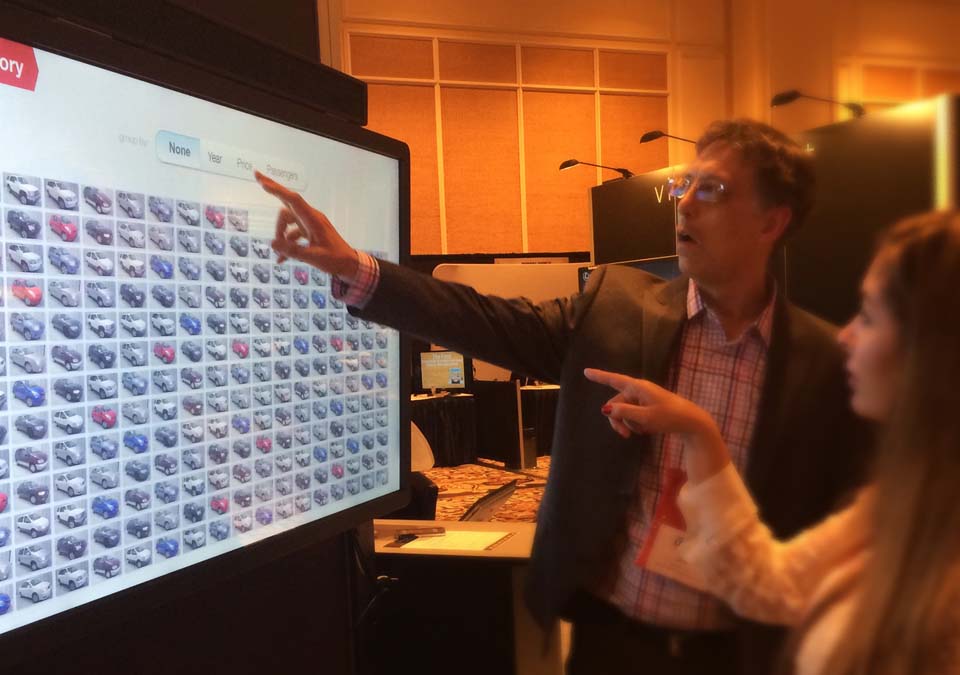
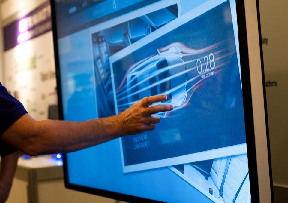
Designing for the oversized versions of touchscreens can present a unique set of challenges.
How do you design for something so big, when you are accustomed to thinking about thumb regions for screen design?
Oversized touchscreens often have such a large field of view that users cannot take in the entire screen with one look. Designers should pay particular attention to element placement and ensure the elements are easy to find on the screen.
Another challenge with large screens is signaling to people that the screens are meant to be touched. Many people do not realize that large touchscreens mounted on walls are touch-enabled because they look like television screens.
While most of the design principles are the same as other interface-based designs, adjusting for size and scale of large screens can be unfamiliar to many designers.
Here are a few best practices to help guide you!

Consider more than finger actions. Think about the entire hand. There’s a reason “swipe right” and “swipe left” are so popular — they are natural hand movements and gestures.
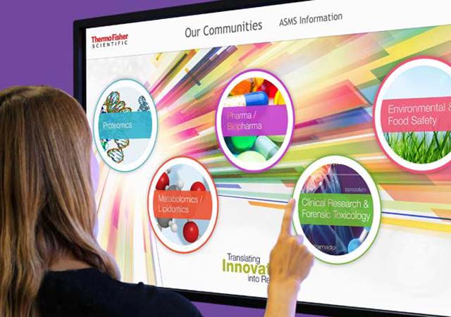
Another natural gesture to think about is eye-scanning. Some oversized screens are too large for the user to take in all at once. Design for eye movement — top to bottom and left to right — to ensure that users see the most important information first.

The bigger the screen, the more overwhelming choices can be. Simplify your design with only a few choices per screen. This reduces visual clutter and creates a more usable interface.
Use visual cues such as animation and buttons to help guide users through the process. Buttons should be obvious and large enough to touch with ease. Use a small animation to help draw the eye to interactive elements.

Content, including text and graphics, needs to be scaled up for oversized screen design.
Note: A bigger screen doesn’t mean more stuff — the opposite can actually be true. Think of it as a different user experience.

Create a navigation pattern for these devices that is always accessible. Use a format that’s similar to commonly-accepted website patterns, such as across the top of the screen or in a sidebar. Make sure that navigation doesn’t go away when different content is accessed.
Try to minimize typing-based inputs as much as possible on these screens. Include a keyboard toggle command in the navigation so users can easily show and hide the keyboard.
People using mobile screens will have a very different touch-screen experience than those using very large touchscreens on kiosks or large pieces of equipment. Keep in mind the different ways in which users interact with screens of various sizes and design the user interface accordingly.
We hope you have found this information helpful! Until next time, happy coding!

Projects
